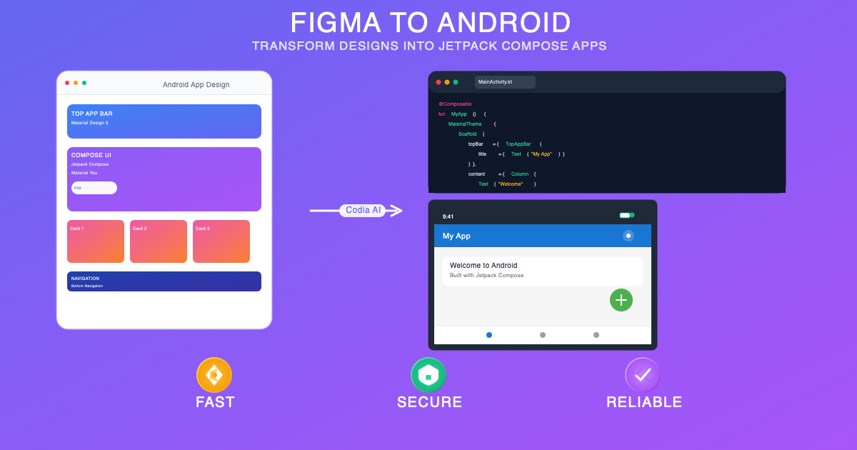
Figma to Android in Minutes: AI-Generated Jetpack Compose Code
Learn how to convert Figma designs into modern Android applications using Jetpack Compose and Kotlin. Generate Material Design 3 components, handle state management, and build responsive layouts with AI-powered code generation.
## Overview

Android development has been transformed by Jetpack Compose, Google's modern toolkit for building native UI. In 2025, the [Codia AI Code Generator](https://codia.ai/code?source=figma&stack=android&from=thbk) takes Android development to the next level by enabling designers and developers to convert Figma designs directly into production-ready Jetpack Compose code, maintaining Material Design principles while ensuring optimal performance on Android devices.

This comprehensive guide explores how to leverage Figma to Android conversion for creating exceptional native Android applications, covering Jetpack Compose best practices, Material Design implementation, and advanced Android features.

## Why Figma to Android Jetpack Compose is Revolutionary

### Native Android Performance
- True native performance with compiled Kotlin code
- Seamless integration with Android system services
- Hardware acceleration and GPU optimization
- Efficient memory management and battery optimization

### Material Design Excellence
- Material Design 3 (Material You) implementation
- Dynamic color theming and personalization
- Adaptive layouts for different screen sizes
- Consistent Android design language

### Modern Development Architecture
- Declarative UI programming with Compose
- Reactive state management with State and MutableState
- Component composition and reusability
- Android Studio preview and hot reload capabilities

## Key Features of Figma to Jetpack Compose Conversion

### 🚀 Compose-First Generation
- Modern Jetpack Compose component structure
- Composable function creation from Figma components
- State hoisting and data flow patterns
- Navigation Compose integration

### 🎯 Material Design Integration
- Material 3 design system implementation
- Dynamic theming with Material You
- Adaptive UI for tablets and foldables
- Accessibility features built-in

### ⚡ Android Ecosystem Integration
- ViewModel and LiveData compatibility
- Room database integration ready
- WorkManager for background tasks
- Firebase services integration

### 🔧 Performance Optimization
- Compose compiler optimizations
- Efficient recomposition strategies
- LazyColumn and LazyRow implementations
- Memory leak prevention patterns

## Step-by-Step Figma to Android Conversion

### Step 1: Android-Optimized Design Preparation
1. **Material Design Guidelines Compliance**
   - Follow Material Design 3 principles
   - Use Android design patterns and conventions
   - Implement proper navigation patterns
   - Consider different Android screen sizes and densities

2. **Component and Asset Preparation**
   - Create Android-specific components and variants
   - Use Material Design icons and components
   - Design for dynamic theming support
   - Plan for Android-specific interactions

### Step 2: Jetpack Compose Code Generation
1. **Access the Conversion Tool**
   - Visit [Codia AI Code Generator](https://codia.ai/code?source=figma&stack=android&from=thbk)
   - Connect your Figma project
   - Select Android frames and components

2. **Configure Android Settings**
   - Choose Jetpack Compose preferences
   - Set target Android API level
   - Configure Material Design version
   - Select architecture patterns (MVVM, MVI)

### Step 3: Integration and Enhancement
1. **Code Review and Validation**
   - Review generated Composable structure
   - Validate Material Design compliance
   - Test on various Android devices and emulators
   - Check accessibility and internationalization

2. **Android-Specific Features Integration**
   - Add Room database for local storage
   - Implement Firebase services
   - Integrate with Android system services
   - Add Google Play optimization

## Jetpack Compose Architecture and Patterns

### Composable Structure and State Management
```kotlin
// Generated Jetpack Compose component with proper architecture
@Composable
fun ProductCard(
    product: Product,
    onAddToCart: (Product) -> Unit,
    modifier: Modifier = Modifier
) {
    var isLiked by remember { mutableStateOf(false) }
    val context = LocalContext.current

    Card(
        modifier = modifier
            .fillMaxWidth()
            .padding(8.dp),
        elevation = CardDefaults.cardElevation(defaultElevation = 4.dp),
        colors = CardDefaults.cardColors(
            containerColor = MaterialTheme.colorScheme.surface
        )
    ) {
        Column(
            modifier = Modifier.padding(16.dp)
        ) {
            // Product image with async loading
            AsyncImage(
                model = ImageRequest.Builder(context)
                    .data(product.imageUrl)
                    .crossfade(true)
                    .build(),
                contentDescription = product.name,
                modifier = Modifier
                    .fillMaxWidth()
                    .height(200.dp)
                    .clip(RoundedCornerShape(12.dp)),
                contentScale = ContentScale.Crop,
                placeholder = painterResource(R.drawable.placeholder),
                error = painterResource(R.drawable.error_placeholder)
            )

            Spacer(modifier = Modifier.height(12.dp))

            Text(
                text = product.name,
                style = MaterialTheme.typography.headlineSmall,
                color = MaterialTheme.colorScheme.onSurface,
                maxLines = 2,
                overflow = TextOverflow.Ellipsis
            )

            Spacer(modifier = Modifier.height(4.dp))

            Text(
                text = product.description,
                style = MaterialTheme.typography.bodyMedium,
                color = MaterialTheme.colorScheme.onSurfaceVariant,
                maxLines = 3,
                overflow = TextOverflow.Ellipsis
            )

            Spacer(modifier = Modifier.height(12.dp))

            Row(
                modifier = Modifier.fillMaxWidth(),
                horizontalArrangement = Arrangement.SpaceBetween,
                verticalAlignment = Alignment.CenterVertically
            ) {
                Text(
                    text = "$${product.price}",
                    style = MaterialTheme.typography.titleLarge,
                    color = MaterialTheme.colorScheme.primary,
                    fontWeight = FontWeight.Bold
                )

                Row {
                    IconButton(
                        onClick = {
                            isLiked = !isLiked
                            // Add haptic feedback
                            HapticFeedback.performHapticFeedback(HapticFeedbackType.LightImpact)
                        }
                    ) {
                        Icon(
                            imageVector = if (isLiked) Icons.Filled.Favorite else Icons.Outlined.FavoriteBorder,
                            contentDescription = if (isLiked) "Remove from favorites" else "Add to favorites",
                            tint = if (isLiked) Color.Red else MaterialTheme.colorScheme.onSurfaceVariant
                        )
                    }

                    FilledTonalButton(
                        onClick = { onAddToCart(product) }
                    ) {
                        Icon(
                            imageVector = Icons.Default.Add,
                            contentDescription = null,
                            modifier = Modifier.size(18.dp)
                        )
                        Spacer(modifier = Modifier.width(4.dp))
                        Text("Add to Cart")
                    }
                }
            }
        }
    }
}
```

### ViewModel Integration with State Management
```kotlin
// Generated ViewModel following Android architecture guidelines
class ProductViewModel(
    private val repository: ProductRepository
) : ViewModel() {

    private val _uiState = MutableLiveData<ProductUiState>()
    val uiState: LiveData<ProductUiState> = _uiState

    private val _products = MutableLiveData<List<Product>>()
    val products: LiveData<List<Product>> = _products

    init {
        loadProducts()
    }

    fun loadProducts() {
        viewModelScope.launch {
            _uiState.value = ProductUiState.Loading
            try {
                val productList = repository.getProducts()
                _products.value = productList
                _uiState.value = ProductUiState.Success
            } catch (exception: Exception) {
                _uiState.value = ProductUiState.Error(exception.message ?: "Unknown error")
            }
        }
    }

    fun addToCart(product: Product) {
        viewModelScope.launch {
            repository.addToCart(product)
            // Show success message or update UI
        }
    }

    fun toggleFavorite(productId: String) {
        viewModelScope.launch {
            repository.toggleFavorite(productId)
            loadProducts() // Refresh the list
        }
    }
}

sealed class ProductUiState {
    object Loading : ProductUiState()
    object Success : ProductUiState()
    data class Error(val message: String) : ProductUiState()
}

@Composable
fun ProductListScreen(
    viewModel: ProductViewModel = hiltViewModel()
) {
    val products by viewModel.products.observeAsState(emptyList())
    val uiState by viewModel.uiState.observeAsState(ProductUiState.Loading)

    Box(modifier = Modifier.fillMaxSize()) {
        when (uiState) {
            is ProductUiState.Loading -> {
                CircularProgressIndicator(
                    modifier = Modifier.align(Alignment.Center)
                )
            }

            is ProductUiState.Success -> {
                LazyColumn(
                    modifier = Modifier.fillMaxSize(),
                    contentPadding = PaddingValues(16.dp),
                    verticalArrangement = Arrangement.spacedBy(8.dp)
                ) {
                    items(products) { product ->
                        ProductCard(
                            product = product,
                            onAddToCart = viewModel::addToCart
                        )
                    }
                }
            }

            is ProductUiState.Error -> {
                Column(
                    modifier = Modifier.align(Alignment.Center),
                    horizontalAlignment = Alignment.CenterHorizontally
                ) {
                    Text(
                        text = "Error: ${uiState.message}",
                        style = MaterialTheme.typography.bodyLarge
                    )
                    Spacer(modifier = Modifier.height(16.dp))
                    Button(onClick = viewModel::loadProducts) {
                        Text("Retry")
                    }
                }
            }
        }
    }
}
```

## Material Design 3 Implementation

### Dynamic Color Theming
```kotlin
// Generated Material 3 theme implementation
@Composable
fun ProductAppTheme(
    darkTheme: Boolean = isSystemInDarkTheme(),
    dynamicColor: Boolean = true,
    content: @Composable () -> Unit
) {
    val colorScheme = when {
        dynamicColor && Build.VERSION.SDK_INT >= Build.VERSION_CODES.S -> {
            val context = LocalContext.current
            if (darkTheme) dynamicDarkColorScheme(context) else dynamicLightColorScheme(context)
        }
        darkTheme -> DarkColorScheme
        else -> LightColorScheme
    }

    MaterialTheme(
        colorScheme = colorScheme,
        typography = Typography,
        content = content
    )
}

private val DarkColorScheme = darkColorScheme(
    primary = Purple80,
    secondary = PurpleGrey80,
    tertiary = Pink80
)

private val LightColorScheme = lightColorScheme(
    primary = Purple40,
    secondary = PurpleGrey40,
    tertiary = Pink40
)
```

### Adaptive Layouts
```kotlin
// Generated responsive layout for different screen sizes
@Composable
fun AdaptiveProductGrid(
    products: List<Product>,
    onProductClick: (Product) -> Unit
) {
    val configuration = LocalConfiguration.current
    val screenWidth = configuration.screenWidthDp.dp

    val columns = when {
        screenWidth < 600.dp -> 1 // Phone
        screenWidth < 840.dp -> 2 // Small tablet
        else -> 3 // Large tablet/foldable
    }

    LazyVerticalGrid(
        columns = GridCells.Fixed(columns),
        contentPadding = PaddingValues(16.dp),
        horizontalArrangement = Arrangement.spacedBy(8.dp),
        verticalArrangement = Arrangement.spacedBy(8.dp)
    ) {
        items(products) { product ->
            ProductCard(
                product = product,
                onAddToCart = { /* Handle add to cart */ },
                modifier = Modifier.clickable { onProductClick(product) }
            )
        }
    }
}
```

## Advanced Android Features Integration

### Room Database Integration
```kotlin
// Generated Room database entities and DAOs
@Entity(tableName = "products")
data class ProductEntity(
    @PrimaryKey val id: String,
    val name: String,
    val description: String,
    val price: Double,
    val imageUrl: String,
    val isFavorite: Boolean = false
)

@Dao
interface ProductDao {
    @Query("SELECT * FROM products")
    fun getAllProducts(): Flow<List<ProductEntity>>

    @Query("SELECT * FROM products WHERE isFavorite = 1")
    fun getFavoriteProducts(): Flow<List<ProductEntity>>

    @Insert(onConflict = OnConflictStrategy.REPLACE)
    suspend fun insertProduct(product: ProductEntity)

    @Update
    suspend fun updateProduct(product: ProductEntity)

    @Query("UPDATE products SET isFavorite = :isFavorite WHERE id = :productId")
    suspend fun updateFavoriteStatus(productId: String, isFavorite: Boolean)
}

@Database(
    entities = [ProductEntity::class],
    version = 1,
    exportSchema = false
)
@TypeConverters(Converters::class)
abstract class AppDatabase : RoomDatabase() {
    abstract fun productDao(): ProductDao
}
```

### Navigation Compose Implementation
```kotlin
// Generated Navigation Compose setup
@Composable
fun ProductApp() {
    val navController = rememberNavController()

    NavHost(
        navController = navController,
        startDestination = "product_list"
    ) {
        composable("product_list") {
            ProductListScreen(
                onProductClick = { product ->
                    navController.navigate("product_detail/${product.id}")
                }
            )
        }

        composable(
            "product_detail/{productId}",
            arguments = listOf(navArgument("productId") { type = NavType.StringType })
        ) { backStackEntry ->
            val productId = backStackEntry.arguments?.getString("productId") ?: ""
            ProductDetailScreen(
                productId = productId,
                onNavigateBack = { navController.popBackStack() }
            )
        }

        composable("cart") {
            CartScreen(
                onNavigateBack = { navController.popBackStack() }
            )
        }
    }
}
```

## Performance Optimization for Android

### Compose Performance Best Practices
```kotlin
// Generated performance-optimized Composables
@Composable
fun OptimizedProductList(
    products: List<Product>,
    modifier: Modifier = Modifier
) {
    // Use LazyColumn for efficient scrolling
    LazyColumn(
        modifier = modifier,
        verticalArrangement = Arrangement.spacedBy(8.dp)
    ) {
        items(
            items = products,
            key = { product -> product.id } // Stable keys for efficient recomposition
        ) { product ->
            ProductCard(
                product = product,
                onAddToCart = { /* Handle add to cart */ }
            )
        }
    }
}

// Stable data classes to prevent unnecessary recompositions
@Stable
data class Product(
    val id: String,
    val name: String,
    val description: String,
    val price: Double,
    val imageUrl: String,
    val isFavorite: Boolean = false
)

// Remember expensive computations
@Composable
fun ProductStats(products: List<Product>) {
    val totalPrice by remember(products) {
        derivedStateOf {
            products.sumOf { it.price }
        }
    }

    val favoriteCount by remember(products) {
        derivedStateOf {
            products.count { it.isFavorite }
        }
    }

    Row {
        Text("Total: $${totalPrice}")
        Spacer(modifier = Modifier.width(16.dp))
        Text("Favorites: $favoriteCount")
    }
}
```

## Testing and Quality Assurance

### Compose UI Testing
```kotlin
// Generated UI test cases for Jetpack Compose
@RunWith(AndroidJUnit4::class)
class ProductCardTest {

    @get:Rule
    val composeTestRule = createComposeRule()

    @Test
    fun productCard_displaysCorrectInformation() {
        val testProduct = Product(
            id = "1",
            name = "Test Product",
            description = "Test Description",
            price = 29.99,
            imageUrl = "https://example.com/image.jpg"
        )

        composeTestRule.setContent {
            ProductAppTheme {
                ProductCard(
                    product = testProduct,
                    onAddToCart = { }
                )
            }
        }

        composeTestRule
            .onNodeWithText("Test Product")
            .assertIsDisplayed()

        composeTestRule
            .onNodeWithText("$29.99")
            .assertIsDisplayed()

        composeTestRule
            .onNodeWithText("Add to Cart")
            .assertIsDisplayed()
            .assertHasClickAction()
    }

    @Test
    fun productCard_favoriteButtonWorks() {
        composeTestRule.setContent {
            ProductAppTheme {
                ProductCard(
                    product = Product("1", "Test", "Description", 29.99, ""),
                    onAddToCart = { }
                )
            }
        }

        // Initially not favorited
        composeTestRule
            .onNodeWithContentDescription("Add to favorites")
            .assertIsDisplayed()

        // Click favorite button
        composeTestRule
            .onNodeWithContentDescription("Add to favorites")
            .performClick()

        // Should now be favorited
        composeTestRule
            .onNodeWithContentDescription("Remove from favorites")
            .assertIsDisplayed()
    }
}
```

### Accessibility Testing
```kotlin
// Generated accessibility-compliant Composables
@Composable
fun AccessibleProductCard(
    product: Product,
    onAddToCart: (Product) -> Unit
) {
    Card(
        modifier = Modifier
            .fillMaxWidth()
            .semantics {
                contentDescription = "Product: ${product.name}, Price: $${product.price}"
                role = Role.Button
            }
    ) {
        // ... content ...

        FilledTonalButton(
            onClick = { onAddToCart(product) },
            modifier = Modifier.semantics {
                contentDescription = "Add ${product.name} to cart for $${product.price}"
            }
        ) {
            Text("Add to Cart")
        }
    }
}
```

## Use Cases for Android Development

### E-commerce Applications
- Product catalog with Material Design 3
- Shopping cart and checkout flows
- User authentication and profiles
- Payment integration with Google Pay

### Business and Productivity
- Corporate dashboard applications
- Employee management systems
- Data visualization with Compose
- Document and file management

### Social and Communication
- Messaging and chat applications
- Social media platforms
- Community and forum apps
- Video calling and conferencing

### Entertainment and Media
- Streaming and media players
- Gaming interfaces and controls
- Photo and video editing tools
- Music and podcast applications

## Deployment and Distribution

### Google Play Optimization
```kotlin
// Generated build configuration for release
android {
    compileSdk 34

    defaultConfig {
        applicationId "com.yourcompany.productapp"
        minSdk 24
        targetSdk 34
        versionCode 1
        versionName "1.0"

        vectorDrawables {
            useSupportLibrary = true
        }
    }

    buildTypes {
        release {
            isMinifyEnabled = true
            proguardFiles(
                getDefaultProguardFile("proguard-android-optimize.txt"),
                "proguard-rules.pro"
            )
            signingConfig = signingConfigs.getByName("release")
        }
    }

    compileOptions {
        sourceCompatibility = JavaVersion.VERSION_1_8
        targetCompatibility = JavaVersion.VERSION_1_8
    }

    kotlinOptions {
        jvmTarget = "1.8"
    }

    buildFeatures {
        compose = true
    }

    composeOptions {
        kotlinCompilerExtensionVersion = "1.5.8"
    }
}
```

### App Bundle and Release Management
- Android App Bundle (AAB) optimization
- Play Console integration and management
- Gradual rollouts and A/B testing
- In-app updates and feature delivery

## Getting Started with Android Conversion

Ready to transform your Figma designs into native Android applications? The [Codia AI Code Generator](https://codia.ai/code?source=figma&stack=android&from=thbk) provides the most efficient path from design to Google Play Store.

### Quick Start Steps:
1. Prepare Android-optimized Figma designs following Material Design
2. Access [Codia AI Code Generator](https://codia.ai/code?source=figma&stack=android&from=thbk)
3. Configure Jetpack Compose and Material Design preferences
4. Generate and download your Android project
5. Import into Android Studio and test on devices
6. Enhance with Android-specific features and deploy

### Android Development Checklist:
- [ ] Material Design 3 compliance
- [ ] Accessibility features implementation
- [ ] Dynamic color theming support
- [ ] Multi-screen size compatibility
- [ ] Performance optimization
- [ ] Google Play guidelines adherence

## Future of Android Development

### Jetpack Compose Evolution
- Enhanced performance and new APIs
- Better integration with existing View system
- Advanced animation and graphics capabilities
- Improved developer tools and debugging

### Android Platform Innovations
- Foldable and large screen optimizations
- AI and machine learning integration
- Enhanced privacy and security features
- 5G and edge computing capabilities

## Conclusion

Android development with Jetpack Compose represents the future of mobile app development, and the ability to convert Figma designs directly into Compose code dramatically accelerates the development process. The [Codia AI Code Generator](https://codia.ai/code?source=figma&stack=android&from=thbk) ensures that your applications not only look exactly as designed but also follow Google's best practices for performance, accessibility, and user experience.

By leveraging AI-powered Android code generation, development teams can focus on creating innovative features and exceptional user experiences while ensuring their implementations meet Google's quality standards for the Play Store.

Start your Figma to Android journey today and experience how automated Jetpack Compose generation can transform your Android development workflow while maintaining the quality and performance that Android users expect.